TANDEM
My role: Visual identity, UX & UI Design, Newsletter
Duration: 12 Weeks
Tools: Figma, Mailchimp
Year: 2023
REIMAGINE HOW YOU FILL YOUR TALENT GAP
Tandem is a finance group in Vancouver. They match growing businesses with fractional talent in finance, accounting, people & ops, marketing, digital systems and more.
Taking full lead on creative direction starting off only with visual identity then leading towards to support with creating the website. A big thank you to the team for this learning opportunity.

PROBLEM
Tandem approached me for a rebranding project. With 10 years of experience in the industry, Tandem was ready to expand its client base beyond small businesses and startups.
As I learned more about their values and mission, I realized how aligned they were with my own, and I knew that working together would be the perfect fit
Create a visual identity deck that aligns with Tandem
Workshop for the team in how to use the new deck
Email newsletter template
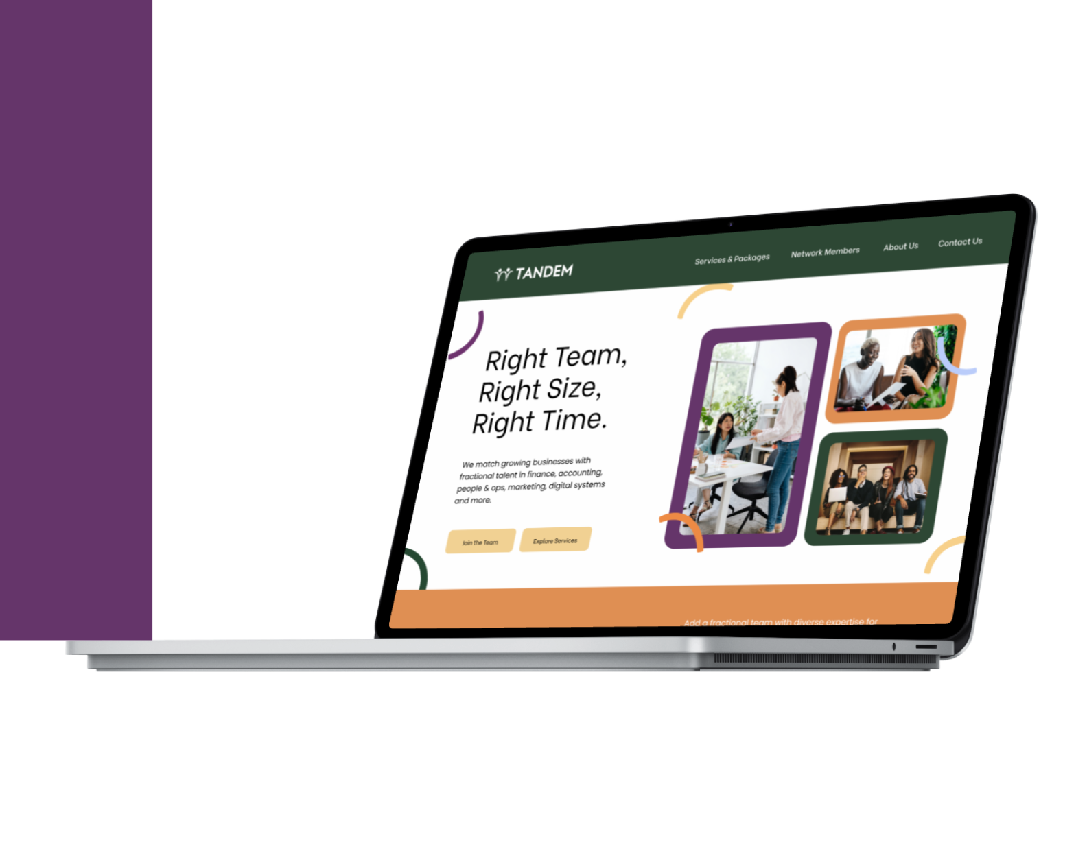
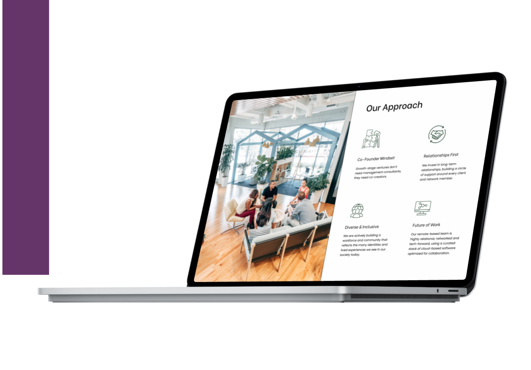
Website hi-fi prototypes
Deliverables & Focus Area
RESEARCH
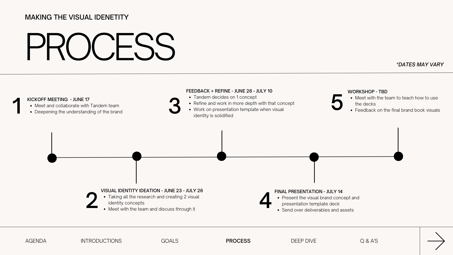
〰️ design sprint kickoff 〰️
A kickstart meeting played a crucial role in gaining a deep understanding of the business and aligning the team's perspectives. This meeting was essential before presenting any brand concepts, as it ensured that I had a comprehensive understanding of the business goals and vision.
DESIGN SPRINT KICKOFF
To facilitate the ideation process for the brand and to help the team get to know me better, I created a comprehensive presentation deck. This deck served as a platform where I could gather all the essential information needed to move forward with the brand development.
IDEATION
〰️ brand concepts 〰️ wireframes
With all the necessary information, I began the ideation process. As a designer, it was essential for me to recognize and get past my own biases when creating the visual identity, so that it would accurately reflect the goals and unique essence of the brand.
This step highlighted the significance of empathizing with the team's perspective and needs. It was a valuable experience, as it allowed both the team and myself to refine the brand guidelines based on their own insights and feedback. This collaborative process proved to be a win-win situation for everyone involved.
BRAND CONCEPTS
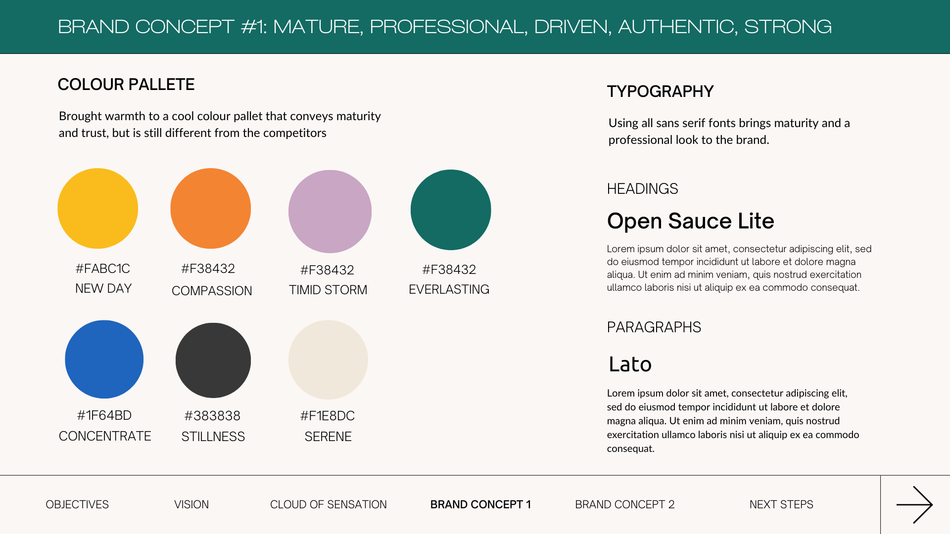
VISUALS #1
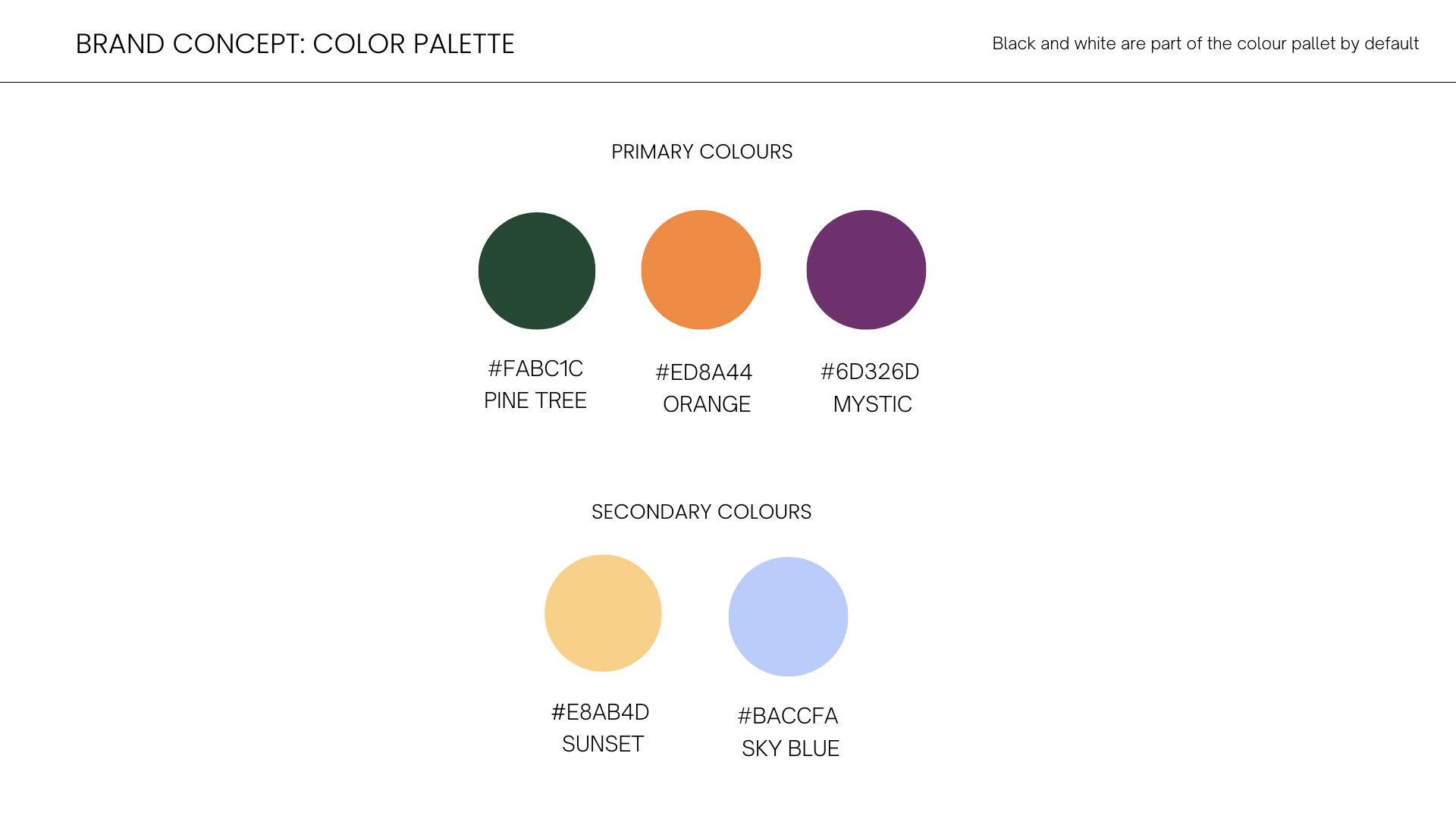
VISUALS #2
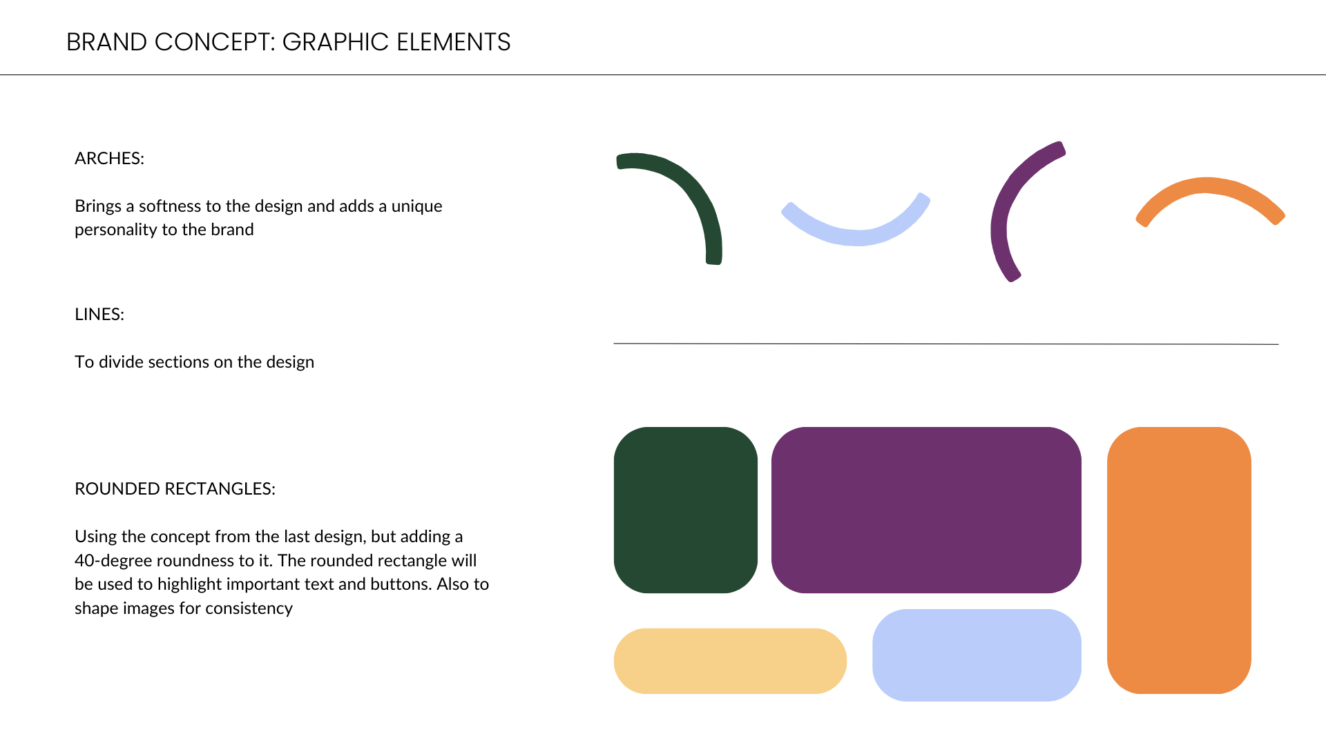
VISUALS #3
WIREFRAMES
As the Tandem project was approaching its deadline, I was asked to create high-fidelity prototypes for the website to optimize its structure and design.
Despite having only a week to design and send off 6 pages for the developers, I accepted the challenge. This phase was where everything came together and the team could finally see the visual identity coming to life.
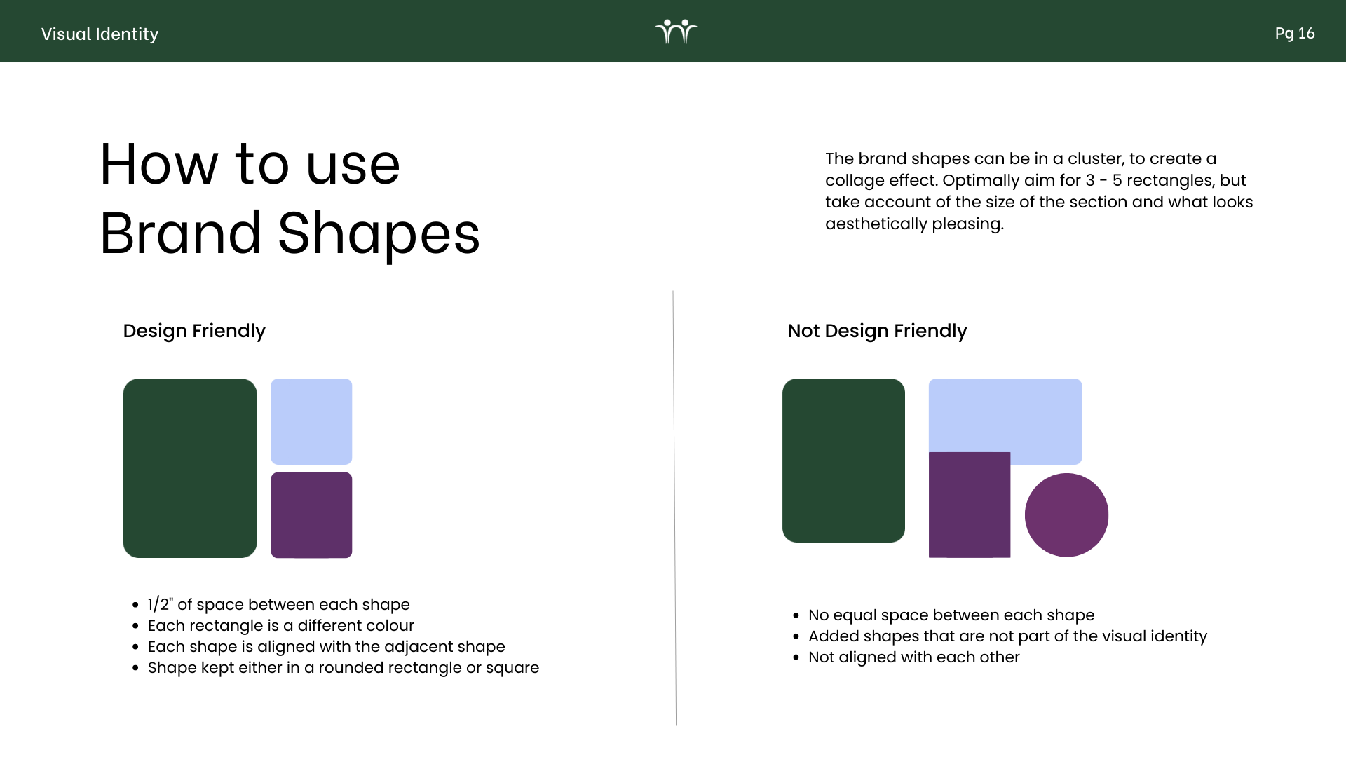
FINAL PRODUCT
〰️ visual identity deck 〰️ hi-fi prototypes 〰️ newsletter templates 〰️

